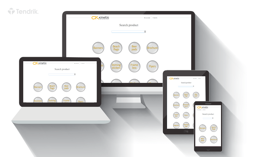
One of the reasons to feel proud is our work with Kinetic. This project shows our devotion and ability to meet the highest requirements. This is also our longest project that lasted a little more than a year. Kinetic is a company that is designing or branding promotional materials and other products. We are happy that we were given the opportunity to work with such professionals and we are extremely proud of the result.
In order to immerse you in the experience completely, we decided to walk you through the website step by step. Only in this way we will be able to show you the website’s many functionalities and features.
When you go to the Kinetic website – http://www.kineticmall.com/, the first thing you will notice is a simply and cleanly designed homepage. But do not be fooled, this is done solely to facilitate the client. For example, the search bar – the first thing we see as we open the homepage. This is done to save time to those who know what they came for. Of course, nothing fatal if you are not part of this group. If you scroll down a little, you will see 21 products on which Kinetic offers their services. The design is innovative – in a small circle you will see the product’s name, but if you hover a little over it, the back of the circle shows where the product itself is visualized. Moreover, a small gallery opens in the upper left corner where you can view details of the product. We will return to that in a minute – let’s continue to the end of the homepage. There you will find more information about the company, means and form for contact, and a possibility to choose your currency. Next to the company’s resume you will see two videos made to optimize the user experience, and help him get the best out of what the site offers. (You will find them attached at the bottom of this post.) We are assuming that you already noticed these two things – the website has only an English version and the currencies the company works with are more than 10 (the most used in Europe and the Americas). The reason for this is that Kinetic (although its main headquarters being in Plovdiv) works in large part with foreign companies. Their studio in Northern Europe have won for them a large portion of this industry in the Nordic contries. Also, their business history includes work with many world-famous big brands.
Let’s go back to the products. We can see the great variety Kinetic offers – banners, business cards, paper bags, wallpapers, stickers and many more. Let’s say we want to make our own business cards. Choosing that we go to the next step – characteristics. On this page we choose the quantity we want made; the size; whether we print only on one side or both sides; whether we want our product laminated and so on. We also choose how many designs we want to create – Kinetic’s software gives us the opportunity to design up to 5 products at the same time! At this stage we also have to choose the kind of our order (normal or express delivery) and to which country we need it delivered. This way, after all the fields have been filled, we will know the cost of the delivery and when to expect it. If we give an okay we continue to the next step. This is where the actual designing thing happens. At this stage we can either upload our own design or use Kinetic’s online editor. Since we do not have a design made in advance, we are going to be using the online editor.
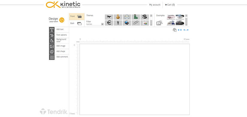
The online editor is actually a canvas with maaaany options and functions. Starting from the sample images from more than 10 different fields, all ready to use, then the “add text” box with more than 20 fonts, different colors and with options for bold, italic or underlined text; different background colors and images for our business cards, plus different forms and comments to add to it, and on top of that a gallery with examples to inspire us as we create. The lines around the canvas are actually rulers that help with our designs and their allignment. At any time we can undo or redo something, anything, duplicate a layer or a picture/text/shape and use many, many other options.
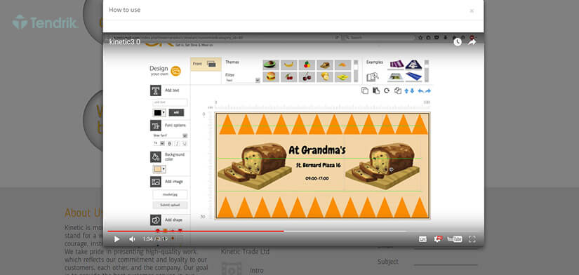
After you are done with you design you have the option to either save it to your profile and use it in the future, or to checkout and order it. At any case you can download you design and generate different type of files (in Illustrator, Photoshop, jpeg/png, and even PDF). After we choose, let’s say, continue to checkout, we must confirm our design one last time. That way if something’s wrong we can go back and fix it. At any time during this process if we choose to leave or refresh the page, a message appears where we must confirm this action – without it if we press, let’s say the red X by accident, our design would have been lost.
So, we’ve managed to arrive at the Checkout page. Here we can complete our order (even if we don’t have an account). However, if we do decide to make an account, we can not only save our designs and beautiful creations, but also take advantage of the customer specials Kinetic offers. After we give all of our data, we must choose a delivery way for our order. If we are from Bulgaria and decide that going to the Kinetic’s actual store is worth the trip, we can check that box. In other case, Kinetic uses TNT or DHL (whatever’s cheapest). We confirm our order and now we are done. All that’s left is to wait and our beautifully designed business cards will be in our hands shortly.
As you can see, Kinetic’s website is pure heaven for anyone that has decided to brand something. Not only everything is simplified and made in a way to stimulate the artist in us, Kinetic have done all that’s possible to be always available for you (whether you will decide to you the intro and navigation videos or the form for a direct contact, it’s up to you).
Happy creating!
If you like our projects and want to use our services, do not hesitate to contact us!

